
Tables and Graphs
Using tables and graphs to present and simplify complex information makes audit observations easier to understand and increases their impact. Figure 4 illustrates how a table may be used to highlight gender analysis. The second table in particular shows that the percentage of senior officers who are female is considerably less than their proportion of the total population.
Figure 4
Examples of Good Presentation of Gender Analysis Data in a Table
Composition of Australia's police services as at 30 June 2006
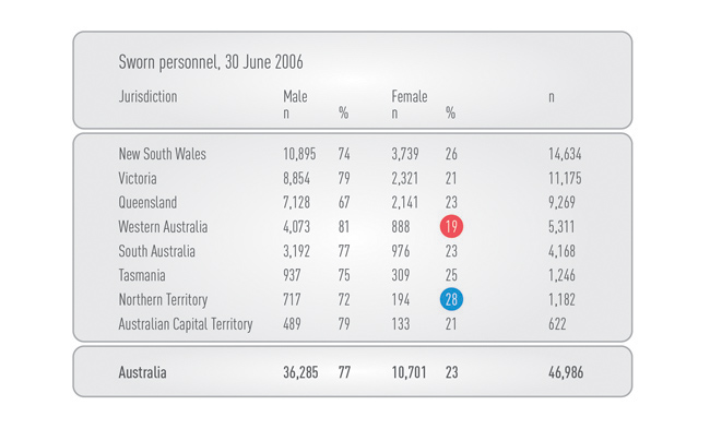
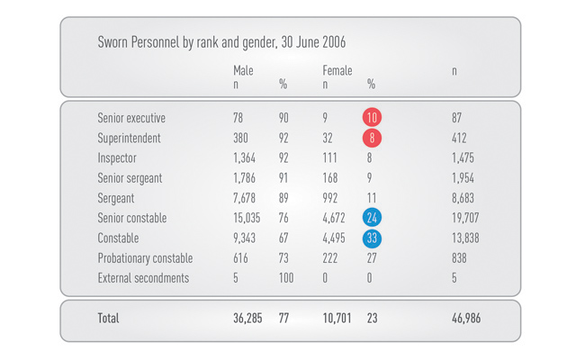
Source: Adapted from Australian Institute of Criminology, site accessed March 2016, http://www.aic.gov.au/statistics/criminaljustice/police_services.html
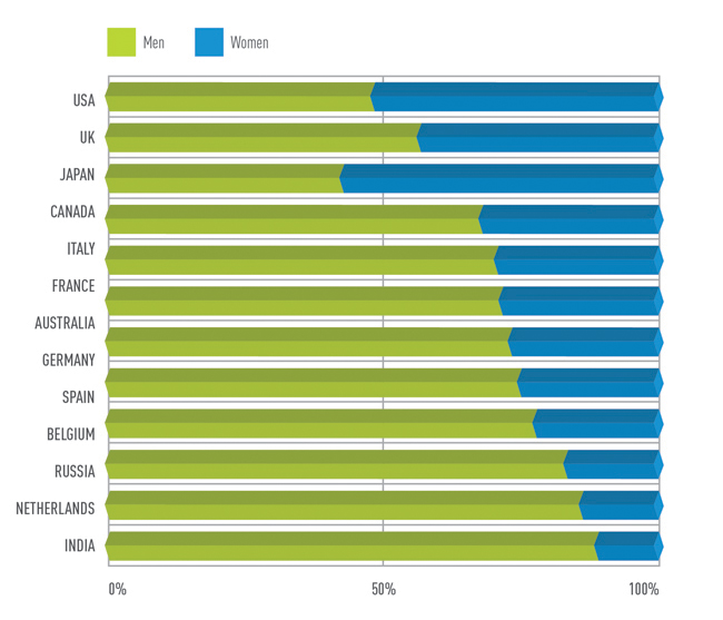
The chart in Figure 5, extracted and adapted from the First ILO Gender Audit (International Labour Organization, 2002), is a simple example of how the results of a benchmarking exercise can be presented effectively. If this data had been provided in a table, it would have lacked the clarity of the chart.
Figure 5
Example of Good Presentation of Benchmarking Data in a Chart
Percentages Male and Female Professional Category-staff, countries with more than 10 staff, ranked by closeness to 50/50 ratio
- PreviousQuantification
- Follow-up Audits
